For around just over a year now i have been collecting bottle tops. I first began collecting them with the intention to use them within my work, as time went on it became more of a habit/obsession. I'm quite a hoarder anyway so the collection grew and grew and now i have around 500. As the collection grew i had to keep changing the container i put the tops in. It began with a small make-up bag, then progressed to a wicker basket.

 I now keep them in a sweet tin (which is almost full):
I think what i like about keeping the bottle tops is how different the designs can be. A lot of them have quite decorative typography and imagery on them which i find quite interesting. I like when i come a cross different design variations of the same drinks. Some Examples:


The tops often have colour variations to indicate types or flavours of the drink, but I think its interesting when there is a variation to the actual design. This could indicate a newer cap so new design.
Here's some other examples that i like the designs of:

I think some of these have really nice typography such as the 'Sam Miguel' and 'Sol' caps. I also really like the 'Corona Extra' because of the use for deep blue and green, the typography on that one is also quite nice.
I HATE it when the top has been bent when its been removed from the bottle. Or when the use by date is printed on the top.
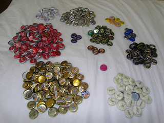
I thought while i have been looking at collections and archives it would be interesting to split the bottle tops into different colour groups:


There's almost a weird nostalgia with collecting these tops. Certain ones remind me of different people. Its also interesting to see what was most popular and and when there's only a few of a certain bottle top that's clearly been an unpopular drink and so never bought again.


No comments:
Post a Comment