 Final outcome, Little Red Comic Strip. I was very pleased with my work for this project and the final outcome. I've also actually really enjoyed doing the work for this project which is important to keep motivated to get the work done.
Wednesday, 8 December 2010
Little Red Comic Strip
 Final outcome, Little Red Comic Strip. I was very pleased with my work for this project and the final outcome. I've also actually really enjoyed doing the work for this project which is important to keep motivated to get the work done.
Pictures Without Words: Little Red Comic


Tuesday, 7 December 2010
Jason


Essay
 Currently writing an essay about designer toys, mainly focusing on James Jarvis. However really like Gary Basemans work and was interested to find out Jim Woodring has also released toys based on his cartoon characters. I've been heavily influenced by Woodrings work, for another project I’m working on. Its good having a link between the project and essay has helped me to keep focussed on both rather than them individually.
Black & white Frank toy by Jim Woodring. Theres also a colour version
Somebody Somewhere Wants a Letter
I also decided to design a football badge to represent him. I really wanted to embroider the badge design onto a t-shirt. However time was against me. I did manage to hand stitch the design which proved very difficult due to the level of detail in the design. If I had more time I would of like to have use an embroidering machine to sew it on.


Wednesday, 21 July 2010
Trip to Dubai: Burj Khalifa


Trip to Dubai: Design Influences
The malls themselves were full of beautiful features to look at. I'd often find myself walking around looking up to the ceilings and due to the vast size of the malls i seemed to find something new each time i went:
Although Dubai itself is quite a modern city i was very interested in the traditional Islamic art. In one of the malls i found a small museum which talked about the origins of Islamic art. I learn that the most distinguished type of Islamic art was called the Arabesque. It is a fusion of pure mathematics and the art of space to create a geometric art. The patterns are apparently designed to encourage deep thought and spiritual contemplation. I thought this linked nicely to the 23 project i had completed just before i went to Dubai. Although in a much more modern and a much less spiritual way.
Anyway here are some examples of arabesque being used which i found on my travels:
Wednesday, 21 April 2010
Pathway Project, Part 2: 23

I liked this idea of playing with shape to form the number. I drew a grid and experimented with different shapes to make up 23. As i was doing this i wondered if i could use 23 squares to form the number 23, and after a few attempts i found it could be done.

from this i photographed the bottle tops, cut the printed paper into 5x5cm squares, and photographed the new arrangement to create the final image:
I'm really pleased with the final outcome, i like its quite a simple but clever idea. I also like that it looks almost like its been made digitally when in actual fact its just pieces of cut out paper.
Pathway Project, Part 1: Bottle Top Collection

 I now keep them in a sweet tin (which is almost full):


I think some of these have really nice typography such as the 'Sam Miguel' and 'Sol' caps. I also really like the 'Corona Extra' because of the use for deep blue and green, the typography on that one is also quite nice.
I HATE it when the top has been bent when its been removed from the bottle. Or when the use by date is printed on the top.
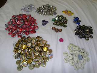
I thought while i have been looking at collections and archives it would be interesting to split the bottle tops into different colour groups:


There's almost a weird nostalgia with collecting these tops. Certain ones remind me of different people. Its also interesting to see what was most popular and and when there's only a few of a certain bottle top that's clearly been an unpopular drink and so never bought again.


